
One of my many tasks in preparation for my PhD is to get my head around the statistical computing programming language, R, which will have a considerable part to play in my upcoming research projects. R supports data analysis and data visualisation, with the help of a huge number of extension packages. I have included this on my blog mostly for my own future reference, but if it goes some way to help others, then it’ll all be worth it.
Did you know? The UK government publishes a huge amount of data… it shouldn’t be too suprising, I’m sure it takes a lot of data to run a country. And, perhaps most important of all their datasets, at least to particularly price-concious greengrocers, is the weekly banana prices1. When looking for a suitable dataset for learning R, this one, understandably, jumped out at me.
So let’s get started! To actually run the R code, I decided to go with RStudio2, a free IDE which combines a number of convenient features into one program… rather handy. Downloading the “machine-readable” data from the government website gave me a nice 13,000 row CSV file. To allow R to do stuff (a technical term) with our data, we need to read the file in.
library(readr)
# A package that helps to read flat files, like CSV.

bananas_24jun24 <- read_csv("<path-to>/bananas-24jun24.csv", col_types = cols(Date = col_date(format = "%d/%m/%Y"), Units = col_skip()))
This very long line of code does the actual reading of data. We provide the path to the file to the read_csv function, alongside a modifier to customise the types of the columns. The first of these sets the format of the dates that we can expect – this means that R can read the date correctly and convert it to a more suitable format for computers (like ISO8601).
We also skip the Units column: if you have downloaded the data, you’ll see this is the same for every row, so no need to include it. We use the R assignment operator <- to give this to a new variable. Our data is now included within our evironment, so we can use operators on it.
But first, let’s make sure it has loaded correctly:
View(bananas_24jun24)If you’re following this in RStudio, the comparably simple function View will bring up a new tab showing a table consisting of all of the data. As I write this, I’ve got an exciting 13,150 entries… I’m easily pleased.
(Box)Plotting our Data
So let’s present our data in a more useful way, using a boxplot:
boxplot(
    bananas_24jun24$Price ~ bananas_24jun24$Origin,
    subset = (bananas_24jun24$Origin=="belize"|bananas_24jun24$Origin=="panama"|bananas_24jun24$Origin=="costa_rica"|bananas_24jun24$Origin=="dominican_republic"),
    col = terrain.colors(4),
    xlab = "Origin",
    ylab = "Price (£/kg)"
)
This is another long line of code, but I’ve kindly split it up because I’m such a great guy. We’re using the boxplot function, as you might have expected – but this one has quite a few different options.
We first specify the data points that we want to compare with ~ seperating them: in this case with Price and Origin. I’ve done this in a special way, where I also specify the dataset and the element of the data I want with the $. You could do this individually too to get the same result:
boxplot(
    Price ~ Origin,
    data = bananas_24jun24,
    ....
I’ve then used the subset to limit the origins. Rather than having a huge boxplot of every banana-exporting country, I’ve picked four: Belize, Panama, Costa Rica, and the Dominican Republic. Using subset as an option, followed by a logical statement of the origin, we check every entry to see if it fits.
The last three options just make our final plot look nice. The col option gives us some nice colours (I’ve used terrain.colors(n), because it picks different colours for each bar… and it is supposed to look a little bit like the ground, I think). I’ll let you take a wild guess on what xlab and ylab mean!
And here’s our final plot:
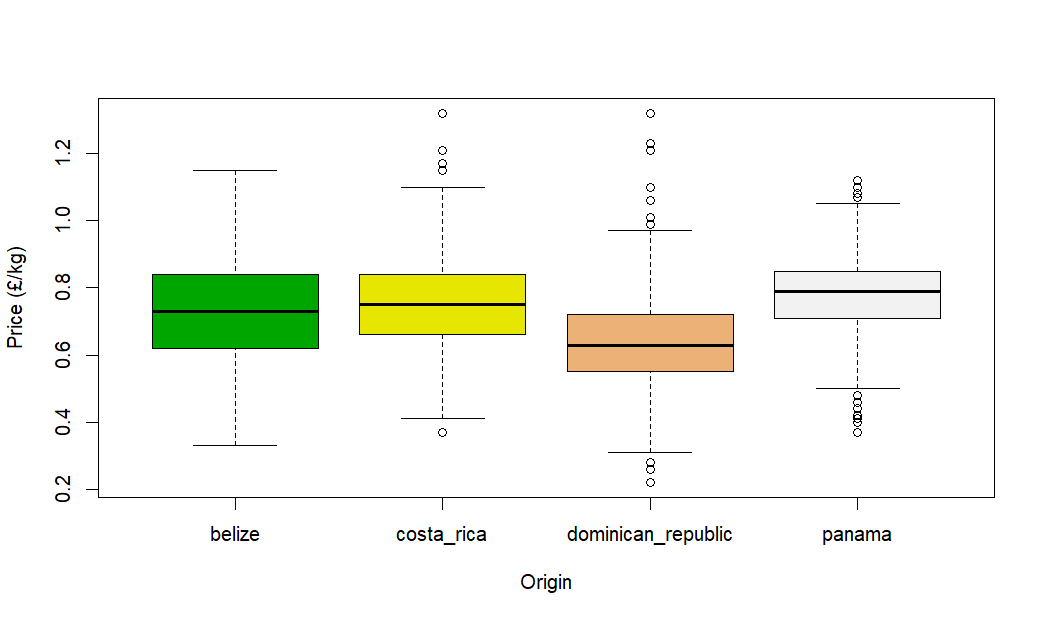
This shows the spread of banana prices for these four countries for the whole of the dataset period. Apart from the discovery that the Dominican Republic is the best place to go for budget bananas, this isn’t particularly useful – let’s do something about that.
Comparing Banana Prices
Do banana prices from various countries mimic each other? Avoiding the need to consult the global banana economy experts, we can instead draw some simple conclusions from our data. Let’s compare two of the countries in the boxplot above: the Dominican Republic and Panama.
But, before we start plotting our graphs, our data is quite messy for this purpose. Because each bit of data contains both a date and the country, there’s a lot of redundancy. So, let’s make it easier to work with using the helpfully named tidyr library.
library(tidyr)
# Helps us tidy our data.

clean_data <- spread(bananas_24jun24, key = Origin, value = Price)
The spread function takes our messy data, and changes it in such a way that we now access data through the Origin, providing some Date, which then gives us a Price. We’ve gone from something that looks like this:
| Date | Origin | Price |
|---|---|---|
| 31/08/2024 | Costa Rica | 0.81 |
| 31/08/2024 | Panama | 0.92 |
| 31/08/2024 | Dominican Republic | 1.02 |
| 24/08/2024 | Costa Rica | 0.79 |
To something a bit more like this:
| Date | Costa Rica | Panama | Dominican Republic |
|---|---|---|---|
| 31/08/2024 | 0.81 | 0.92 | 1.02 |
| 24/08/2024 | 0.79 | NA | NA |
This makes it a lot easier to compare the prices of individual countries on each date. Another small problem though… not every origin has a price on each day. There’s no way to compare Costa Rica and Panama directly on the 24th as Panama has no value (or in this case the R “Not Available” flag.
Let’s create a new dataframe with just the columns where two countries both have a value. Let’s do this first for Panama and the Dominican Republic.
pa_vs_do <- clean_data[!is.na(clean_data$panama) & !is.na(clean_data$dominican_republic), ]This line of code just takes the relevant parts of the clean_data which conform to the logical statement provided. Here, we’re only including data where the Panama value and the Dominican Republic value are not not available… a double negative so logically interesting, I had to include it.
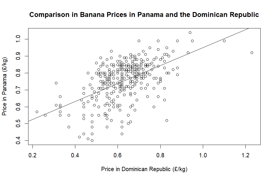
So, we have our nice set of data – let’s finally plot it. For this we use the more basic plot function, with the x and y values first, followed by labels and the main title:
plot(
    pa_vs_do$dominican_republic, pa_vs_do$panama,
    xlab = "Price in Dominican Republic (£/kg)",
    ylab = "Price in Panama (£/kg)",
    main = "Comparison in Banana Prices in Panama and the Dominican Republic"
)
There seems to be a little bit of a relationship, but let’s see if we can quantify this with a linear model. R features a handy lm function for just such a thing.
model <- lm(pa_vs_do$panama ~ pa_vs_do$dominican_republic)
# Creates the linear model - note that Panama is now first as the target.

abline(model)
# abline adds the model line to the existing graph.

summary(model)
# Gives us a helpful summary of the model parameters.
With the line on the graph, it looks like it’s in the right place:
And the summary gives us some more information about this model:
Residuals:
Min 1Q Median 3Q Max
-0.34029 -0.05152 0.01815 0.06472 0.20785
Coefficients:
Estimate Std. Error t value Pr(>|t|)
(Intercept) 0.41929 0.02610 16.06 <2e-16 ***
pa_vs_do$dominican_republic 0.53133 0.04101 12.96 <2e-16 ***
---
Signif. codes: 0 ‘***’ 0.001 ‘**’ 0.01 ‘*’ 0.05 ‘.’ 0.1 ‘ ’ 1
Residual standard error: 0.09771 on 387 degrees of freedom
Multiple R-squared: 0.3025, Adjusted R-squared: 0.3007
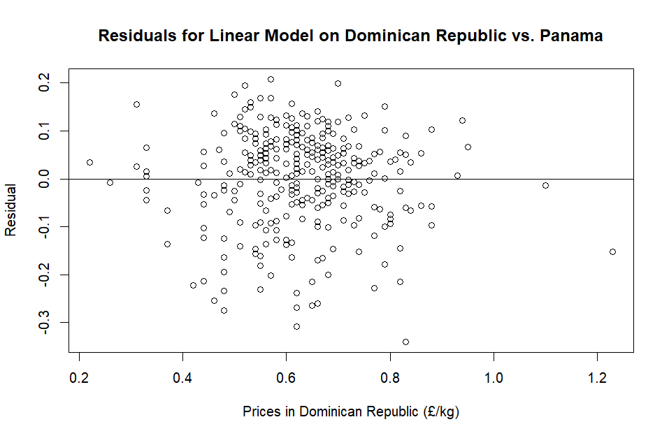
F-statistic: 167.9 on 1 and 387 DF, p-value: < 2.2e-16Our R-squared value seems quite low, but we can perhaps see that from the plot above. We can use the residuals to see if any other relationships might be hiding somewhere in the data. R helps us with this, with a simple resid function.
residuals <- resid(model)
# Gets the residuals from our model.

plot(
    pa_vs_do$dominican_republic, residuals,
    xlab = "Prices in Dominican Republic (£/kg)",
    ylab = "Residual",
    main = "Residuals for Linear Model on Dominican Republic vs. Panama"
)
# Plot the residual against the x axis.

abline(0,0)
# A horizontal line at y=0 to help us identify any patterns.
Perhaps a better statistician might see something here that I don’t… Let me know if you do!
Shared Borders
While I had all this data available, I thought I also ought to check to see if there are any similarities with countries that shared a border. Sticking with Panama, I copied all of the previous steps but comparing it with its Northern neighbour, Costa Rica. Here is the result:
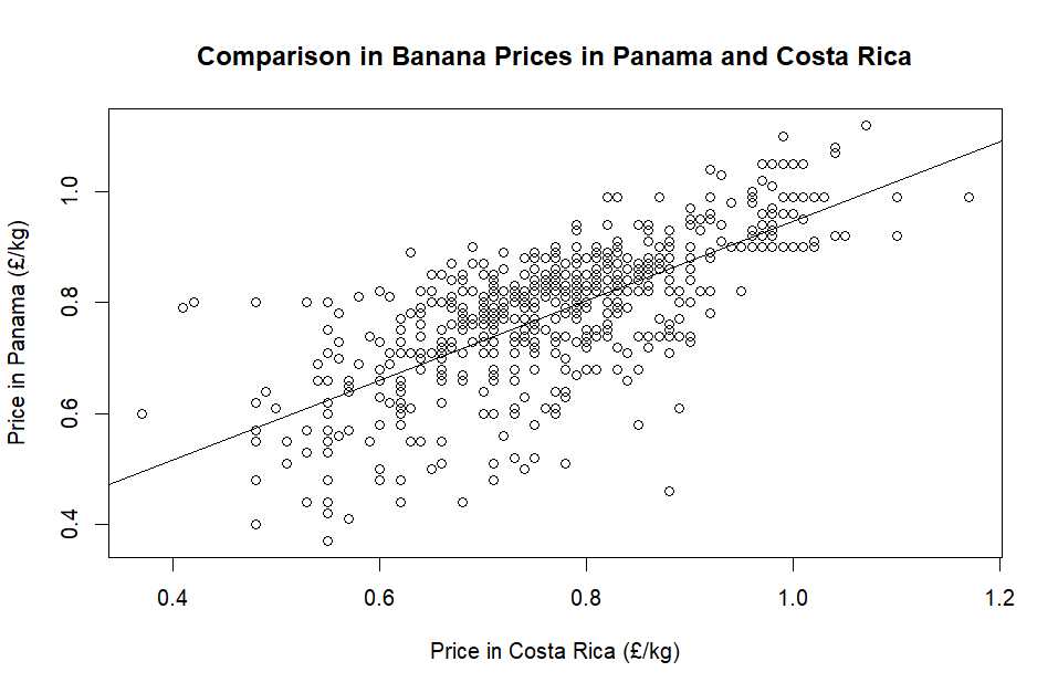
With an R-squared value of 0.530: perhaps this could suggest Costa Rica and Panama, as bordering countries, share more factors which might influence banana prices, compared with Panama and the Dominican Republic?
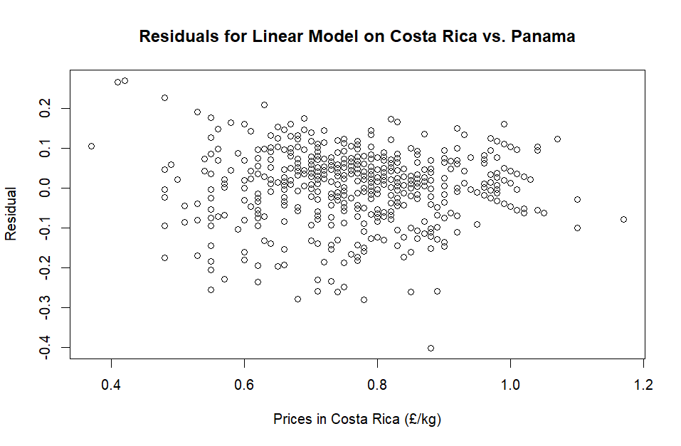
The residuals look somewhat similar when compared to the previous test. In both residual plots, there appears to be some hexagonal-like (and in straight lines) stacking going on… if any mathematicians have got this far, please let me know if this is a normal thing or else it’ll bug me!
Conclusion
There is much more for me to learn when it comes to R… but I hope that this banana-based investigation has been, in any way, useful for you too.
Footnotes
- If you’d like to sample the delights of the banana dataset, you can download it here: https://www.gov.uk/government/statistical-data-sets/banana-prices ↩︎
- Download RStudio here: https://posit.co/products/open-source/rstudio/ ↩︎
Featured Image: Photo by Thach Tran from Pexels.